The Formosa House
To renovate their Victorian terrace in West London, Creative Directors of Horror Vacui, Andrés Lareu and Camilo González, consider not just how they want to live in their home today, but how the house would have been lived in since its original construction. By combining this insight with resonances of the cultural interior trends that punctuated the preceding decades, they are creating a home that elevates the past, yet feels authentically modern. We chat to Camilo about their journey transforming The Formosa House, to find out how they are ensuring that the property truly lives up to its name.
When I bought this house I was looking for a starting point that would guide the rest of the project. The house was in deplorable conditions, all I knew was that it had been built in the mid-1860s in the midst of the Victorian era, in an area that had grown a lot during those years, which we now call ‘Little Venice’.
Personally, I do not believe at all in historical forgery, but one thing I knew is that for this renovation it would be crucial to preserve the few original materials and maintain the stately character of the house’s architecture. We could say that the style of the project was not chosen by me – it was already proposed by the house.
The past is always an inexhaustible source of inspiration to draw upon, which you may have heard before. Now, the real interesting thing in respect to the past is the possibility of new interpretations. However, when approaching a new project there really isn’t a specific formula.
According to our times, I wanted an effect of simplicity in the space, something that was proposed organically from the architecture of the house. With this being said, I’m not talking about minimalism pushing aside all the story that the house has to tell. But, at the same time, I didn’t want the vintage character to take over our approach so that it would end up looking like a museum.
The austerity, the simplicity and why not also the severity of the life of those years in which the house was built inspired me to recreate unembellished spaces that create a link with the lifestyle to which we are used to living today – think of a Vermeer or a Hammershoi painting.
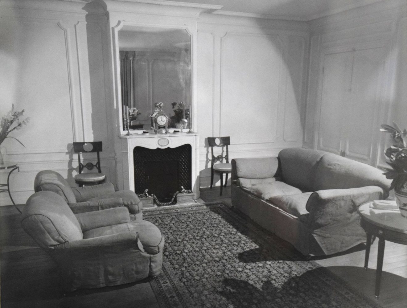
Often today there is a revisionism in the world of interior design, trying to find the origins of the stripped principles which are so in-vogue nowadays. Undoubtedly, the main style-maker was the French decorator Jean-Michel Frank, noted for bringing an unprecedented simplicity that hasn’t been seen so far.
What few people know is that his mentor and professional guide was the Chilean socialite Eugenia Errazuriz, who taught everything to the designer. And what is even less known is that such inspiration of wanting to eradicate every useless object in space came from living in London.
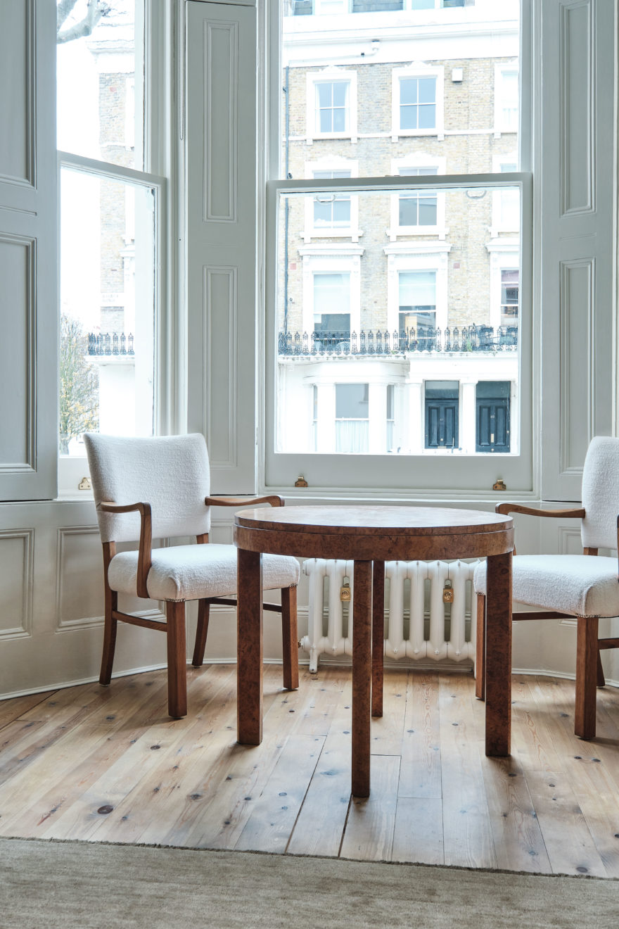
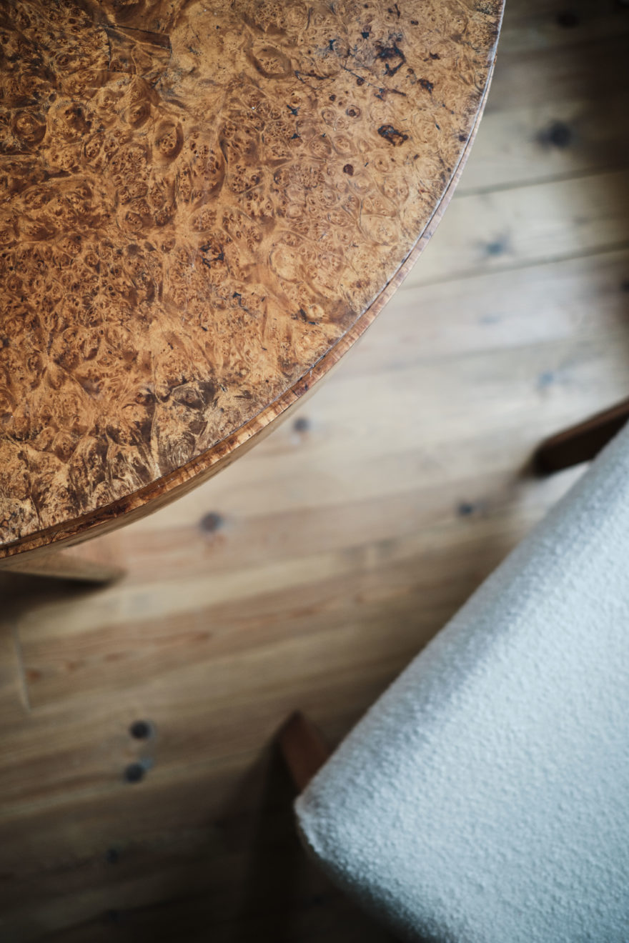
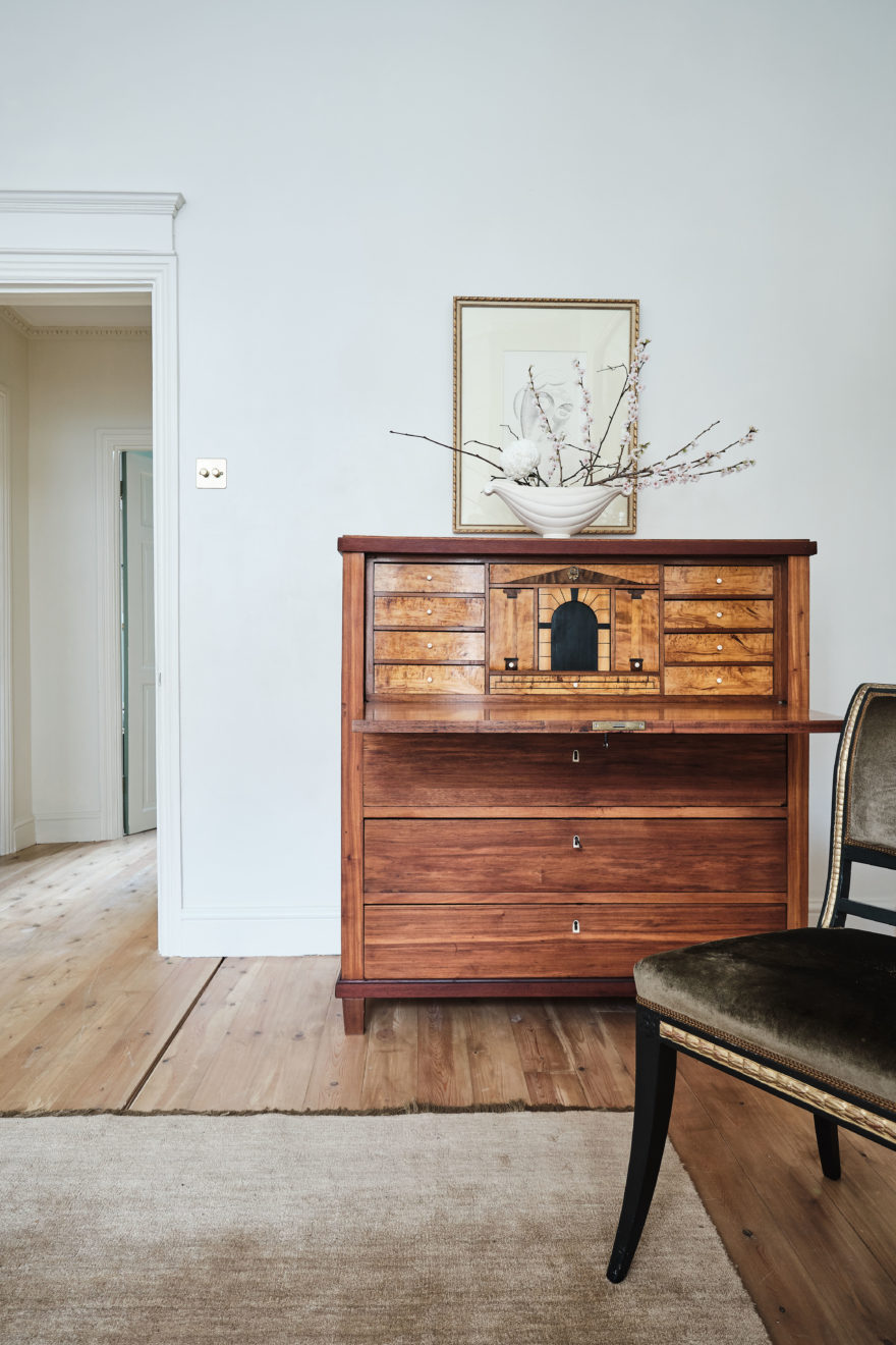
That first germ that inspired Madame Errázuriz to start a trend throughout the last century was, somehow, my own trigger, one hundred years later. It was the reason we decided to go back to the original wooden floors or, for example, to recover the window shutters which have been sealed for decades and retained that dark stain, painted in the Victorian era to make them look more luxurious. We recovered every little corner where it was possible, and if it wasn’t possible it was subtly replaced or accompanied with reclaimed materials.
In Horror Vacui our distinctive approach reflects the historical, political and social forces that have shaped our environments. But it is worth clarifying that they are not twin projects.
We allow ourselves to have more fun, where the ephemeral format opens up a broader game for us, where many more elements are involved such as the history of fashion, politics, literature and other nods to different genres of culture. But definitely – for those who know the style of Horror Vacui – we often pay tributes to the history of design.
Colour-wise I think it is always a challenging choice in any home, regardless of the scale of the project. I did a lot of research. I have read the entire blog of Patrick Baty (an Historical Paint Consultant) and came to the conclusion that I wanted (beyond the colour) a clay finish. I did not want anything synthetic or too bright, and between a labyrinth of a thousand shades of off-white I found the tone that was closest to the colour of a stone, as it was used to back in the day.
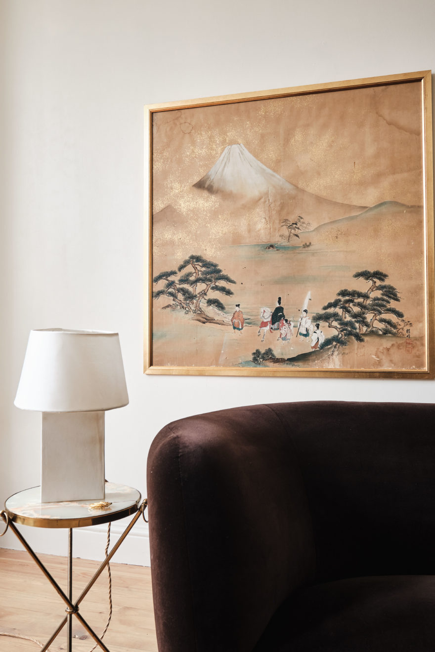
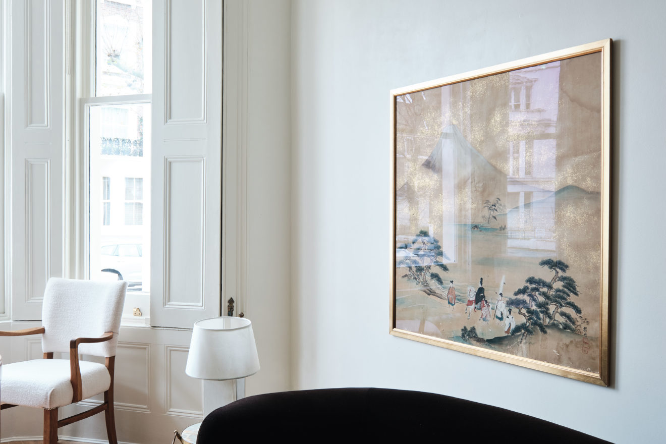
When it comes to designing a space, choosing the artwork is perhaps one of the most challenging things. I think one of the few rules was that there should be no replicas or prints. We considered that the texture, the materiality of the artist’s brush stroke made the difference in this project.
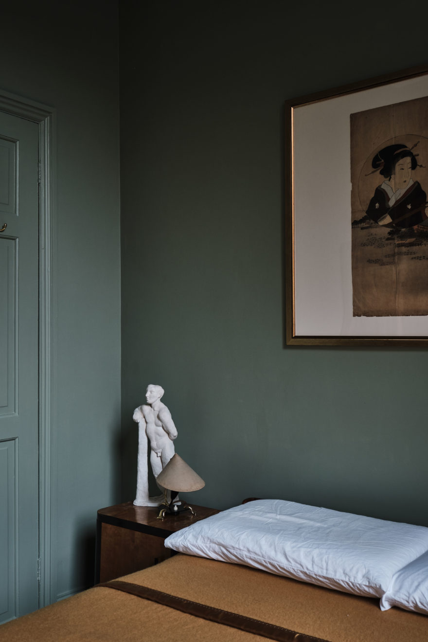
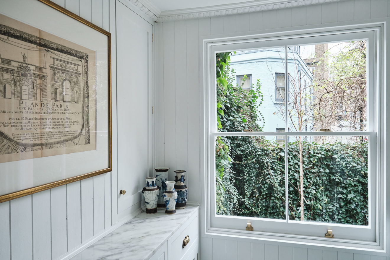
Of course, acquiring art is not an easy task and can often be very expensive. But since we were not following trends, we have been able to acquire pieces with character in auctions. The first pieces we got were of Asian origin. We chose them because, somehow, they brought that harmony that we were looking for and they’ve been used successfully through decades in every possible style.
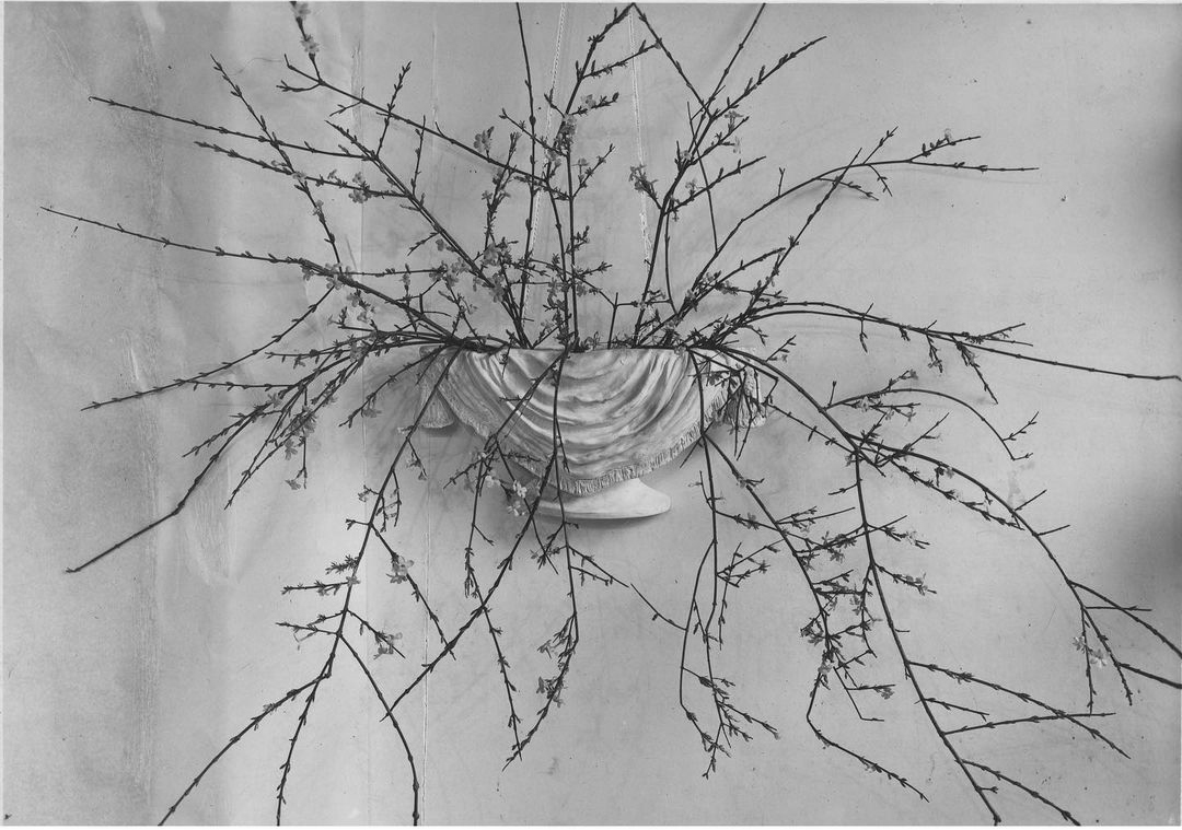
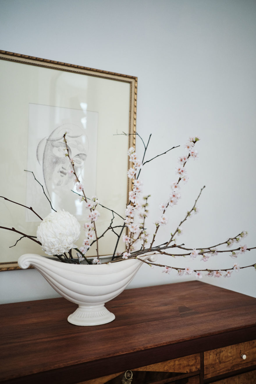
In a second phase we decided to incorporate elements with sculptural features. Plaster pieces influenced by the work of Giacometti commissioned by Jean-Michel Frank and the pottery of Constance Spry.
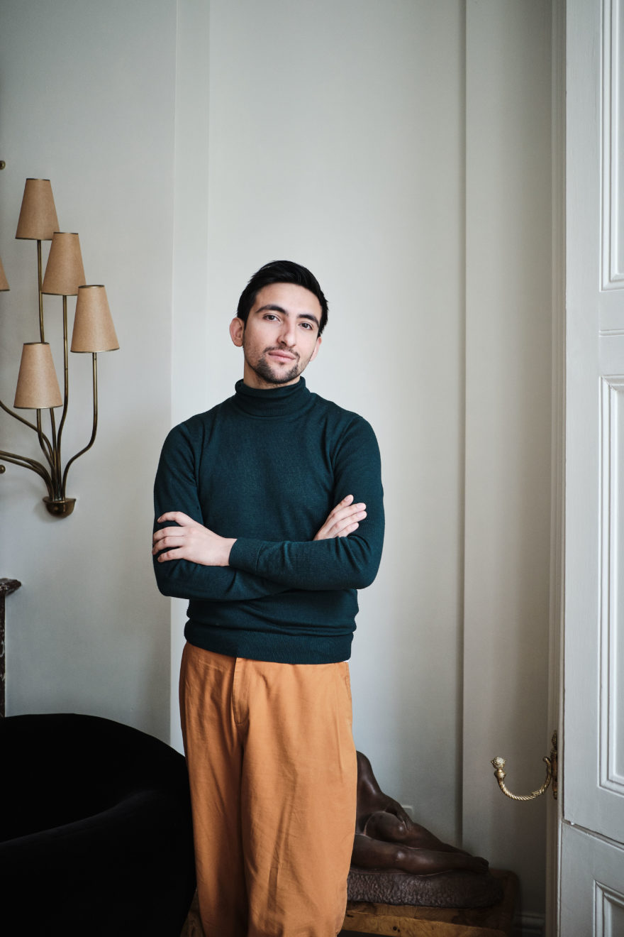
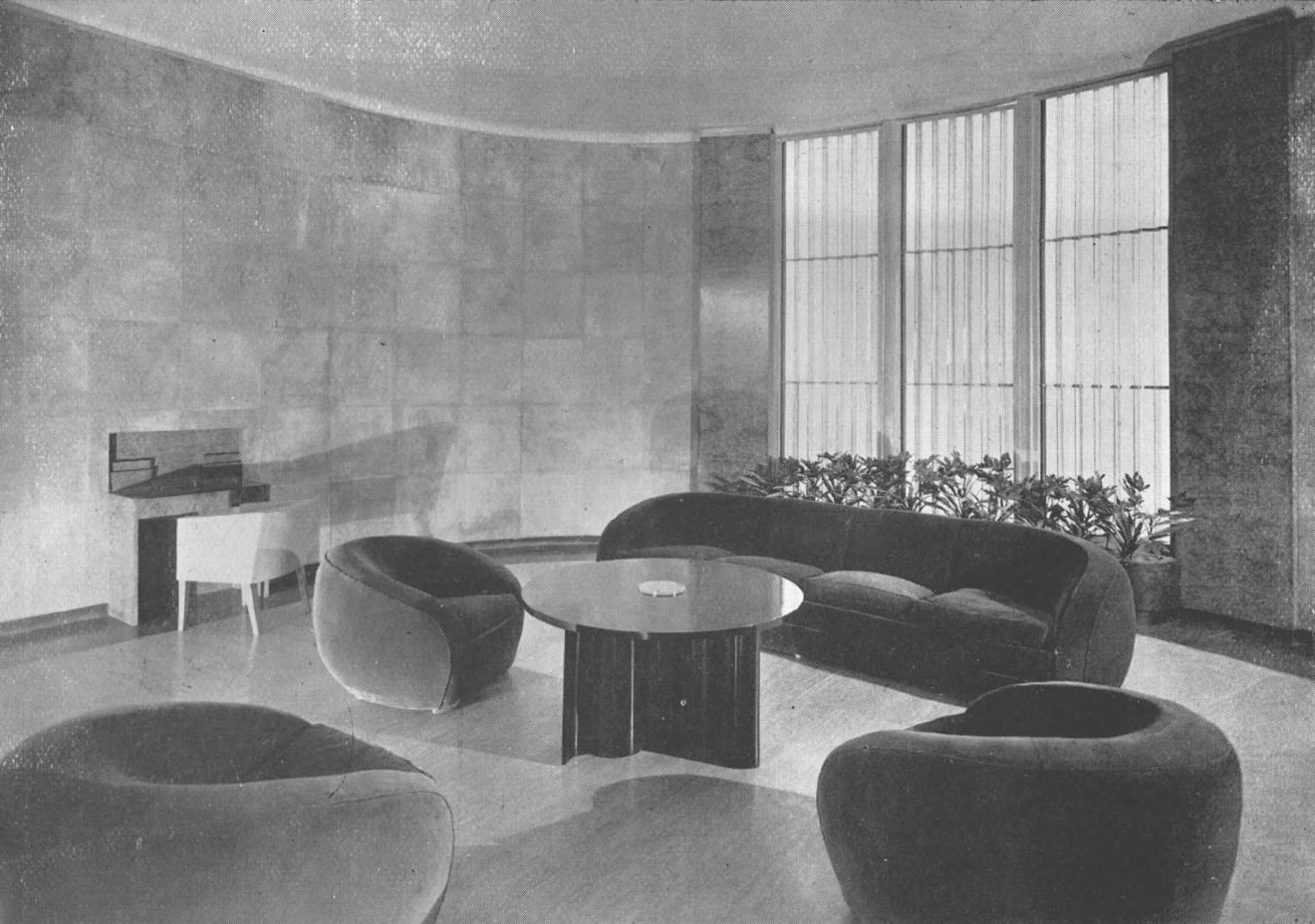
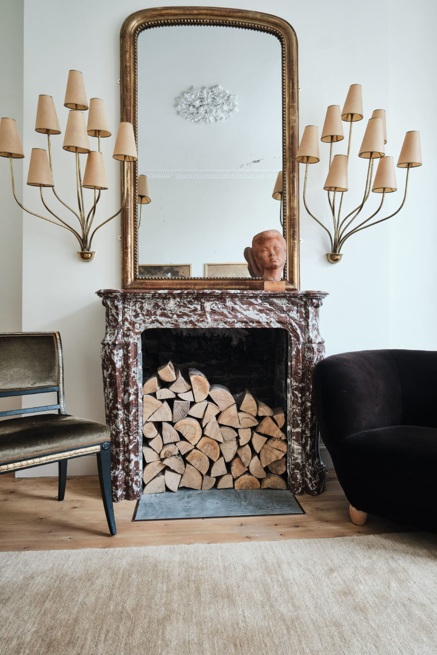
We also took inspiration from the 100 per cent original lobby at the Kavanagh building in Buenos Aires, which was decorated by Jean-Michel Frank, and we decided to reupholster our sofas in dark cocoa velvet. The star piece of the house are the Persane wall lights by the French designer Jean Royère.
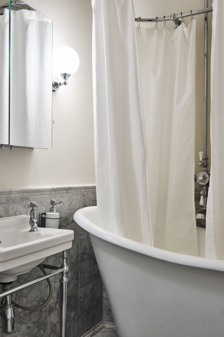
I have no doubt that the kitchen and the bathroom were the spaces that underwent the biggest transformation. Generally, these spaces tend to age very quickly, since they are highly influenced by the styles of each decade. Naturally, when these houses were built, there was neither a bathroom nor a kitchen as we know them today – that is why in the case of the bathroom we decided to give it an Art Deco or early 20th-century look, which is the closest to today.
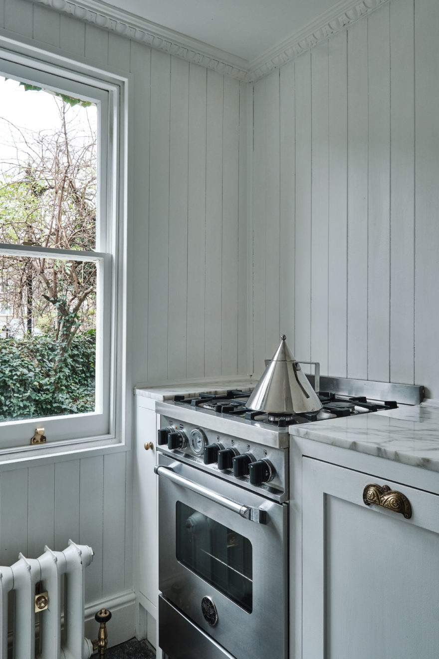
The kitchen is influenced by a more Dutch style, with its shaker-style cupboards, marble chessboard and cladding on the walls. The objects were selected thinking about those trophies that Dutch sailors brought from China and that influenced Delft porcelain.

