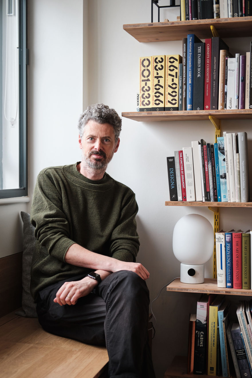
Ben Allen
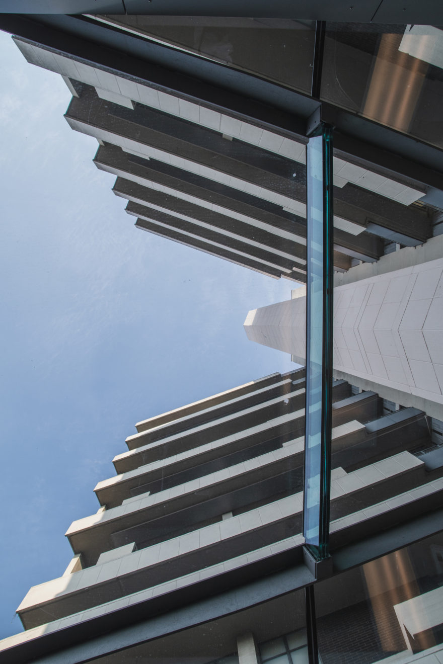
When Denys Lasdun designed Keeling House, he intended it to be high-rise social housing with a distinct, neighbourly feel, that encouraged the community spirit he’d witnessed along traditional Victorian terraces. After a thorough renovation by a private developer in 2001, the cluster of tower blocks has retained an iconic status in architectural circles and, in 1993, was Grade-II* listed.
We caught up with one of Keeling House’s residents, Ben Allen, to find out about family life in his ‘cottage in the sky’. We discover if Lasdun’s original objective has been achieved, and what innovations Ben has brought to his maisonette, as an architect himself.
I had it on my radar. I was living in Shoreditch, so was in the neighbourhood and would pass it quite regularly. It was actually my wife who was the catalyst for us moving here; we were looking at a house that was in a poor state of repair but it was quite a liability, and we would have ended up living in it in a state of dereliction until we could afford to refurbish it. So, it was her suggestion that we buy something more manageable! We initially thought we’d only work on it cosmetically but we ended up having a very cold winter, and so decided we wanted to insulate and put new heating in. It ended up being a full flat refurbishment.
I think that an architect can only do about half the job – people need to want to be connected. There’s a nice spatial hierarchy in terms of where you are; we know our immediate neighbours pretty well, as each deck serves two flats. There are another pair of flats on our side of the lift and we also know those neighbours quite well. So, you have this interesting thing in that you know the people on your local ‘streets’.
During lockdown, and due to communal repair conversations, everyone’s been brought together and people have reconnected. The number of kids also connects residents, as there’s a lot more people standing in the landscaped areas and car park as their kids cycle around. The sense of community has got a lot stronger in the last few years. Some of that is by design, some by want, and some by accident; all three create a very strong community, which is really nice.
There’s aren’t huge communal areas but those that we have are very well used. There is the lobby to the front of the building, which is large enough to house communal meetings. Then, two sides of the building are landscaped, there is the pond around the glazed lobby, and the car park. These areas serve well for accidental or impromptu meetings with neighbours, whether it’s when you’re collecting your post or when parents are watching their kids playing.
I imagine, historically, a two-bedroom maisonette in the 50s would have been for a family with a child or two, possibly three. A lot of people in the building have one or two children, but I suspect that it’s the community and the love for the building that keeps people here when they could probably get more spacious homes further out. It being so central means that, for many, a move to a more a spacious flat or house would mean moving quite far afield, so it’s a big step.
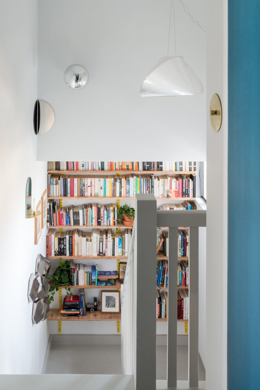
It was in reasonable condition, but the radiators were under sized and so it was cold in the winter, which is why we wanted to put better insulation and new underfloor heating. It was quite typical in style – when the building was renovated 20 years ago, they made it much more modernist; more open plan, with white walls and beech-wood doors and fittings. I found that interesting, as I don’t think that Keeling House was ever like that, although there are no pictures of the flats’ interiors as they were when the building was first finished, only architects’ drawings.
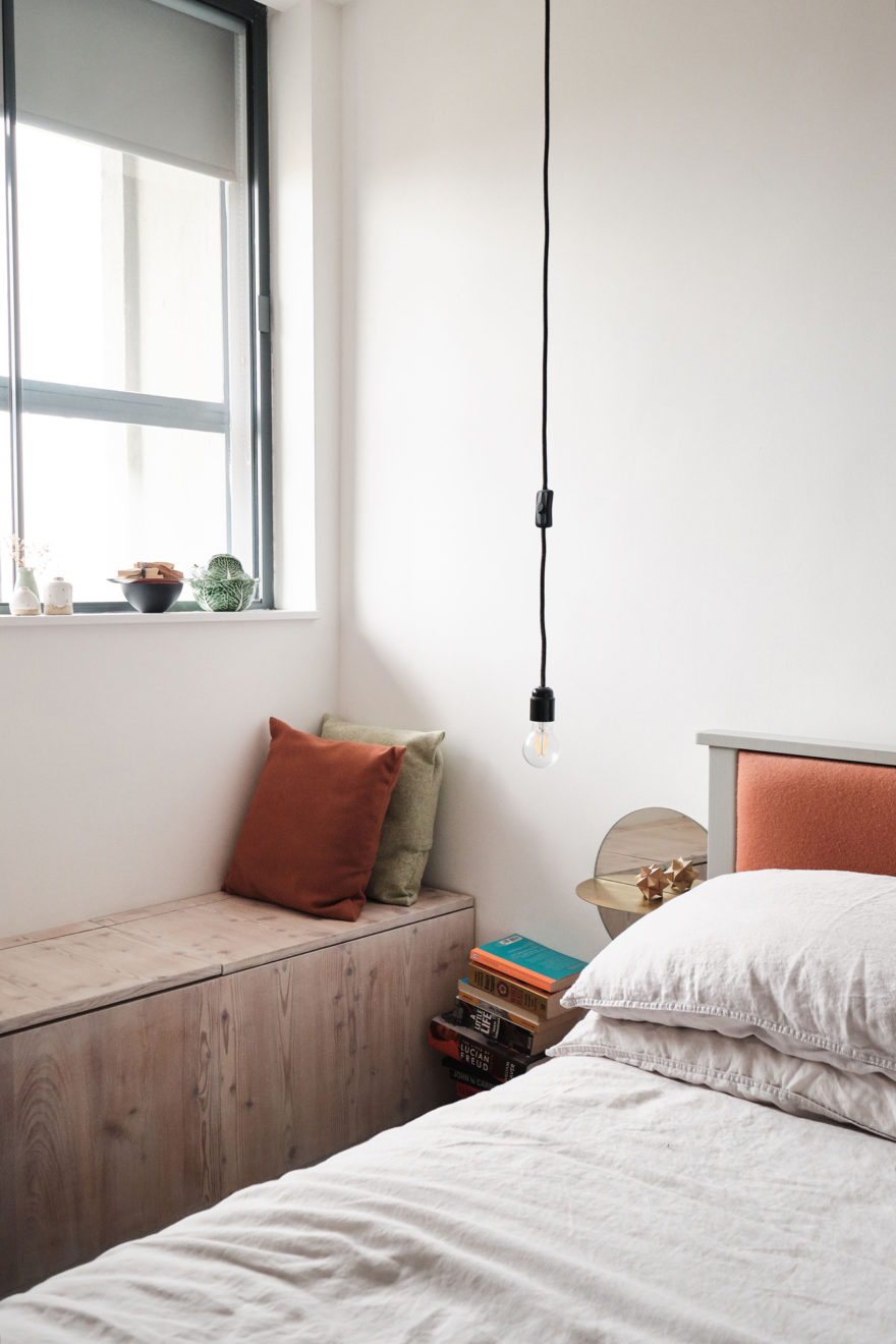
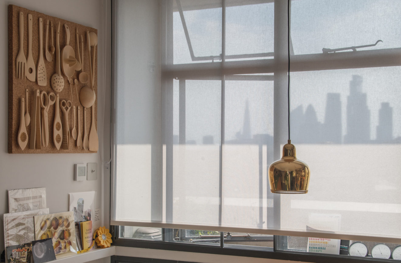
I don’t even know what was typical in the late 50s but I imagine it would have been more colourful – modernism was more colourful and less minimalist and ‘white box’ like. Due to the scale of the maisonettes, Keeling House has a ‘cottages in the sky’ feel. There’s a large area of glazing on our maisonette’s southwest side, so it can feel quite exposed. I wanted to make it feel warmer and to create a stronger sense of enclosure, to provide a balance with the expansive views.
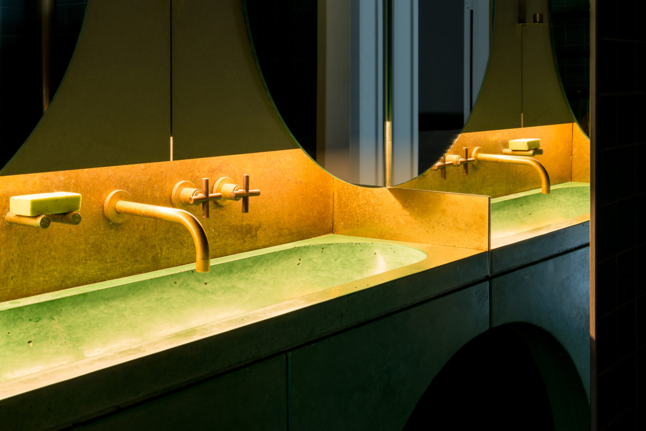
Mainly the bathroom. It’s quite fun. I sort of went to town on it and made it quite elaborate and playful. We’ve reused some of the ideas in different ways in other projects – making a bespoke shower, for example, which is, surprisingly, not that complicated. On a comfort level, underfloor heating is always a winner (I don’t think there’s anyone who’s ever complained about underfloor heating!) – especially in a concrete building.
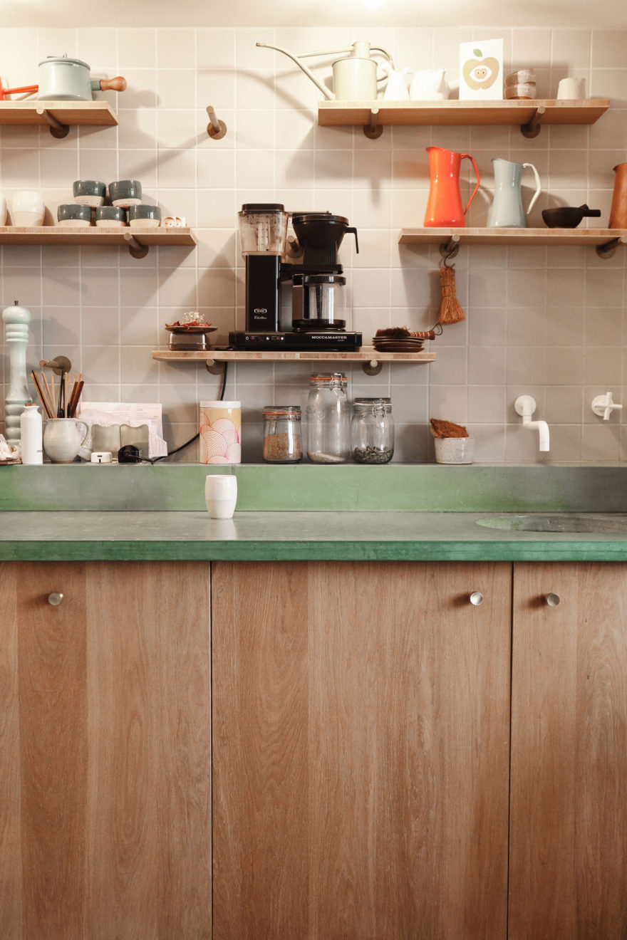
Concrete counters are loved by architects as they’re very durable. Casting things is always fun, and I had the idea to use pigment and play around with it, to show that concrete doesn’t always have to be grey – it’s a good opportunity to bring colour into a space. What was brave is that we only sealed it with a light sealant, as we wanted it to age quite naturally. That’s been quite interesting, as it’s tarnished and started to look distressed in a very pleasing way.
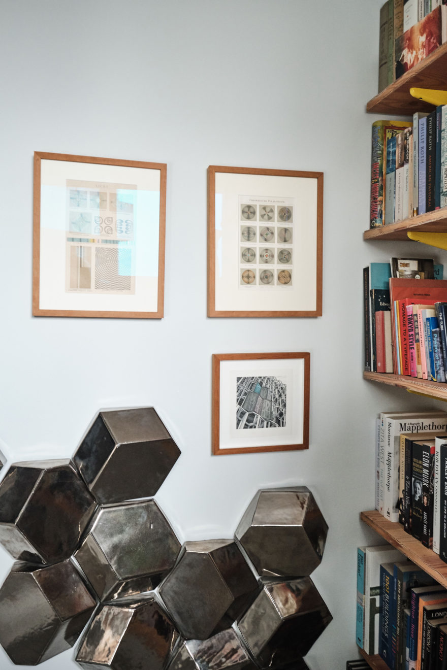
Other artists, and architects houses. One of the things I enjoy doing most is visiting these; Casa Estudio Luis Barragán in Mexico City, the Eames House in California, and Sir John Soane’s house in London, for example. I find it interesting to visit the homes to architects or designers I admire. Goldfinger’s house in Hampstead is another example – the house itself is in some ways quite simple (it was one of his early works) but the collections of things in the house has been relatively unchanged since it was lived in in the 60s and 70s, even down to the lino that’s been heavily worn with use.
These houses are so often interestingly designed and used. It’s fascinating how many modernist designers’ homes are packed full of stuff. The artist Donald Judd is the most ironic example of that; he collected so many things that he bought a whole town in Marfa, Texas, to spread his collections of furniture and objects around the various buildings. He has an incredible amount of things for one of the world’s most famous minimalists!
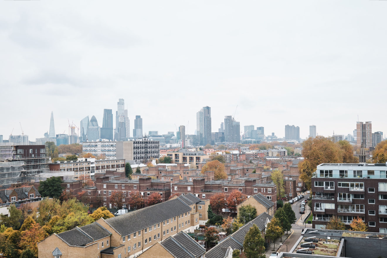
It has been quite sociable but in the last year and a half it’s become much more of a refuge, due to the pandemic. They’re not very big flats but we have had a few parties – it’s quite utilitarian in that respect. One of the nice things about living in a high-rise apartment is that you do get a sense of privacy and enclosure, from which you can enjoy views over the city you’ve just dived off the streets of.
The maisonette format adds to that – a small house in a high rise is attractive and appealing. It’s not common as it’s not very space efficient. But it’s charming, and strongly domestic with an upstairs and a downstairs. Having three of us now adds to that – putting the baby to bed and coming downstairs makes it feel very much like a small house.
Part of the idea of doing this was to test out ideas, details and materials that we were keen to use in other projects. Some are small luxuries, others are simple, functional elements. We’ve used the coloured concrete a few times since, as it’s a striking way to bring colour into a space without painting the walls.
I also like the way my wife uses the space, as she has a desk in the spare room but also uses the window seat in the living space – it’s nice to have different places we can work, and enjoy the views. That’s come through to other projects too. It’s definitely affirmed some of the things we were doing in the practice on other projects, and we can authentically say to clients that we know a certain things works really well, as I live with it.

