Elphinstone Road by DEDRAFT
Following a successful sale of Elphinstone Road, we spoke to Grant Straghan – director of DEDRAFT architects – to find out how his practice transformed this Warner home in Walthamstow to make it more appealing and practical for a young family. The architects cleverly maximised the natural light and flow of space with a modern rear extension, whilst retaining and reinstating many of the house’s original features.
Before discovering DEDRAFT, an initial search of local practices hadn’t filled our clients with the buzz and inspiration that one would hope for when undertaking work on a first home. They chose us because we offer the reassurance that on every project, we’ll achieve a unique design that’s tailored to the client’s needs – considering the elements of function, form, and aesthetics.
We find there can be a lack of practices who offer in-depth creative exploration. This means they fail to address aspects that can transform a run-of-the-mill remodelling project into a more efficient and enjoyable home.
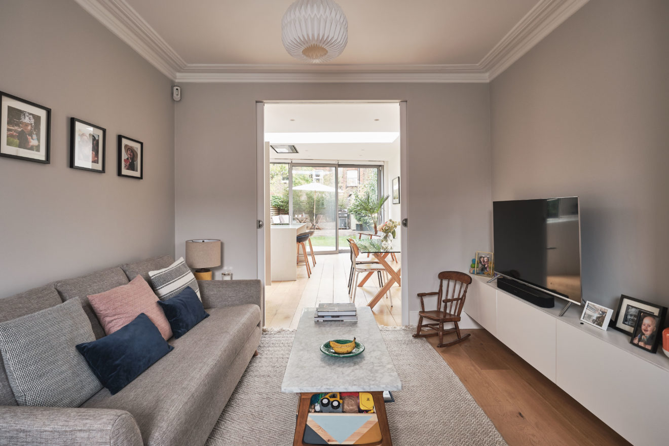
The original footprint was a square – typical of local Warner houses – with circulation space kept to a minimum. Largely, all the original rooms had been retained, which fragmented the flow between the ground floor living spaces and the garden. Little had been made of the rear garden and its relationship to the house. The kitchen also felt cut-off from the rest of the house, which didn’t work with today’s desire for open-plan living.
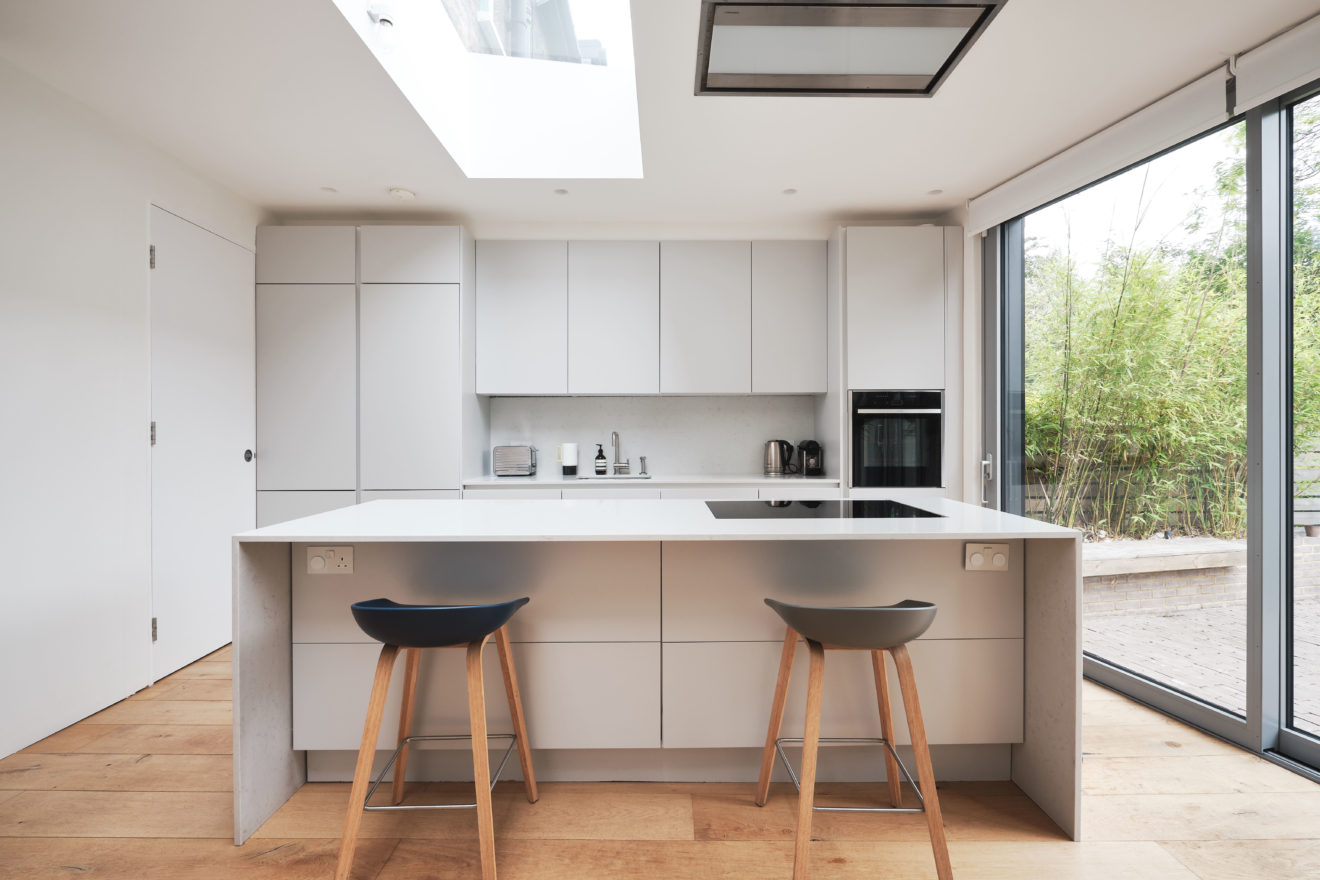
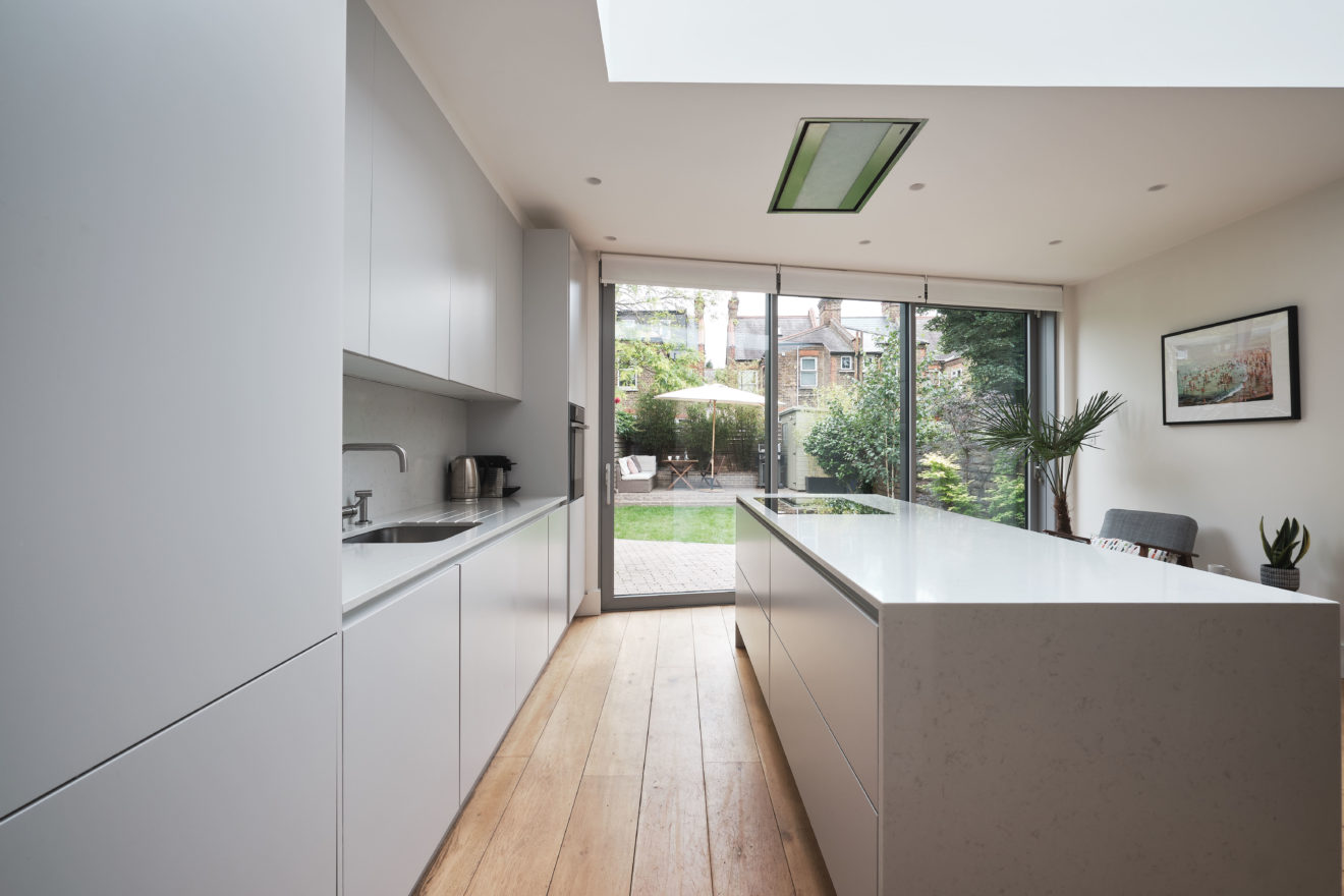
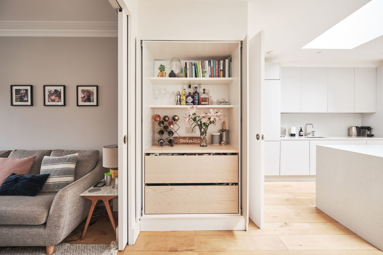
Being a young couple, they were keen to reconfigure and modernise the internal layout; removing walls to open-up views and improve the flow and flexibility of the living space. They also wanted to add a light and spacious kitchen/dining extension with direct access to the rear garden. This would also increase the limited storage space that’s typical of Warner houses.
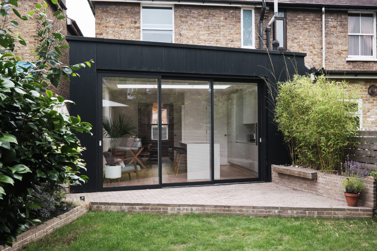
The brief for the rear extension was for a simple, refined addition that sought not to duplicate or blend-in with the existing property but complement it with bold and contrasting materials.
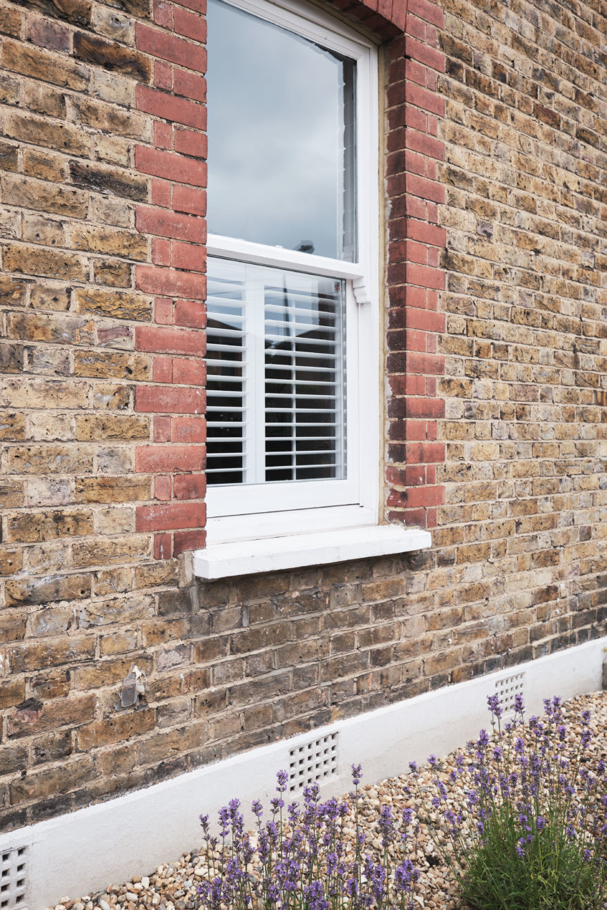
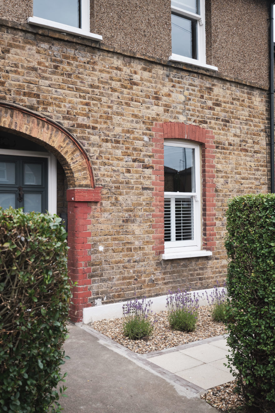
Given our knowledge of Warner homes within Walthamstow – and having seen many with mundane additions that fail to address the basic aspirations of a new owner – it was our wish to retain as much of the original character as possible. We removed the uPVC windows and replaced them with timber box sashes, we also replaced the front door with a new Warner-design door and reclaimed ironmongery from the period.
To the rear, we felt a bolder and more contemporary design was achievable. Given it was to sit amongst other ‘builder-designed’ extensions, we wanted to utilise and benefit from its favourable position at the end of the terrace.
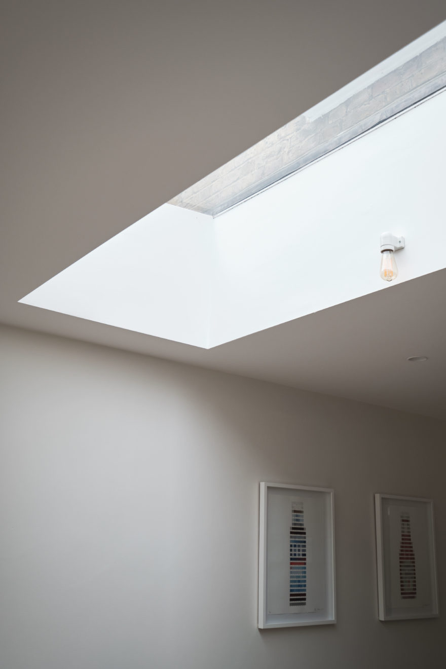
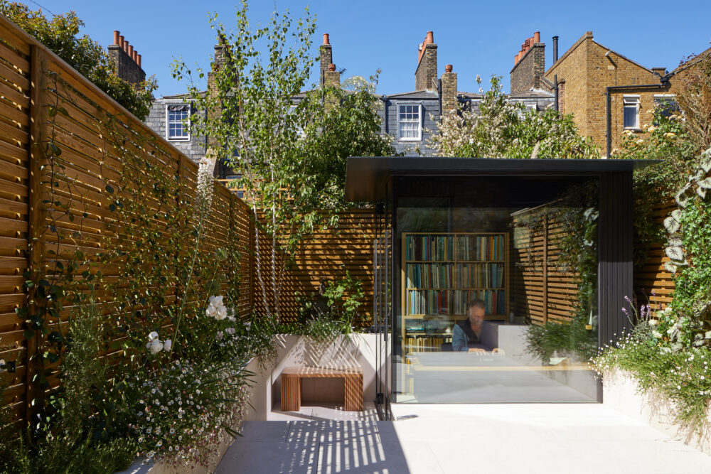
By making the most of the added plot width and by slightly angling the rear wall on the extension, we were able to increase the floor area to create a light-filled and modern living space. Bold, contrasting materials were used that offered a less domestic but ultimately more contemporary and striking aesthetic. Adding a wildflower roof to the flat roof of the extension softened the view from the first floor, helping to blend it with the garden below.
Yes, for sure. The homeowners came to us with several ideas that they briefed us to explore. We addressed these and also introduced many others in an early feasibility study, presented to them prior to the planning submission.
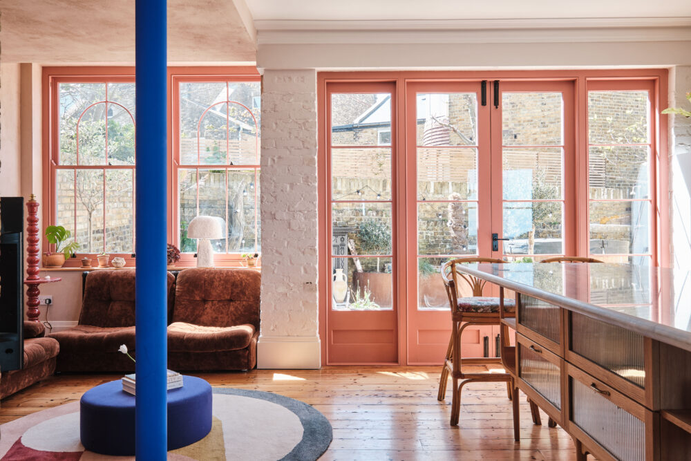
Having recently revisited the house (we obtained consent to convert the loft), a feature that’s had the most impact on the owners’ day-to-day life would be the new kitchen/dining space. With a young family, this has been central and transformative to the way they use their home. Open-plan spaces are much more enjoyable for children and easier for parents to keep watch, so they can be free to roam and play while the huge sliding doors offer control over their inside-outside movement.
With the goal of using a contrasting palette of materials, the client had expressed a desire for a black-clad addition to complement the proposed heavily planted rear garden. We first explored timber cladding but issues with planning, durability and maintenance pushed us down the route of a more robust industrial metal. To address the domestic scale and to enable better detailing, we opted for a micro-corrugated aluminium cladding that was powder-coated to a soft black. Jet black just felt too stark.
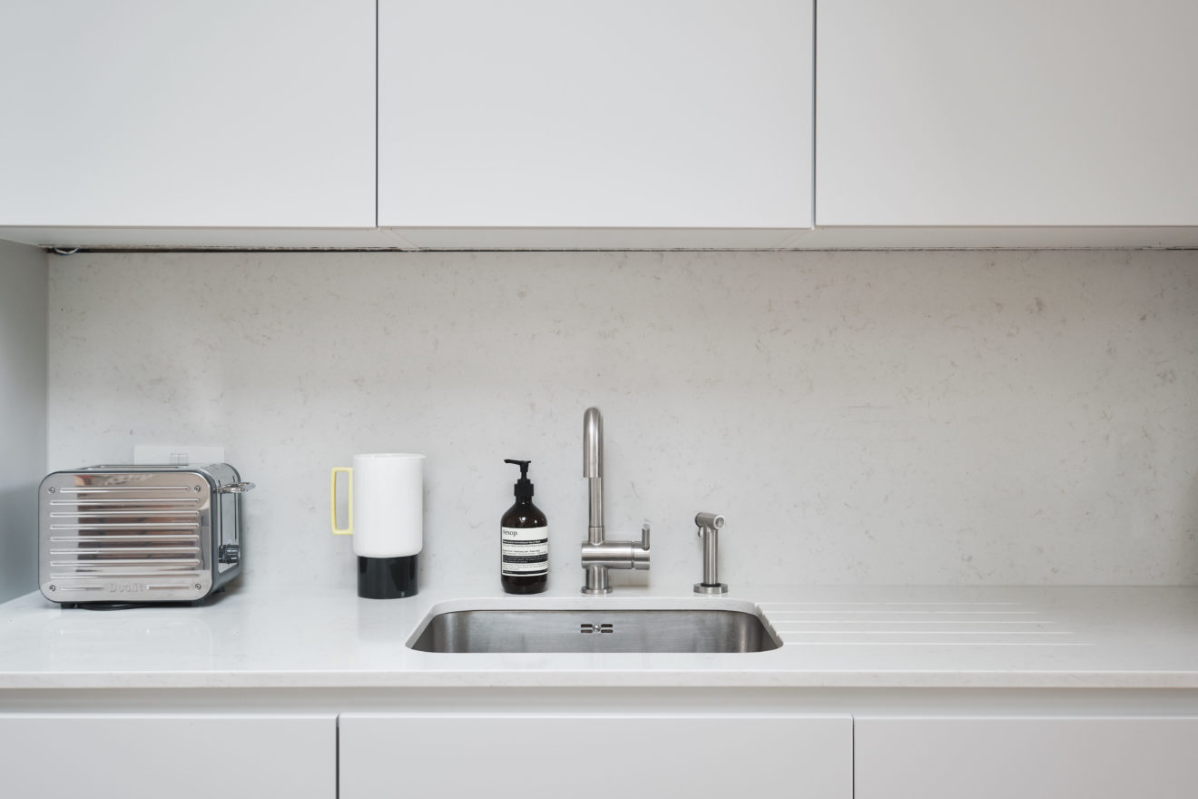
For the kitchen, we introduced the client to a Danish supplier called Svane who we’d worked with previously. Without a UK showroom, this was somewhat a leap of faith by the client but resulted in a really well designed, high quality product for a competitive price. It’s an end result that we were all very pleased with!
At the time, we were looking at simple, modest Japanese houses and gardens. Taking inspiration from their clever utilisation of small spaces as well as traditional industrial/agricultural sheds and cladding.
To get the most rewarding end result, we always explore aspects of space, material, light and proportion. This enables our clients to buy into and understand the process. To see how and why our design has arrived where it has. Without this full understanding from all parties, decisions are made that could result in an amalgamation of several ideas but without a coherent approach pulling them all together.
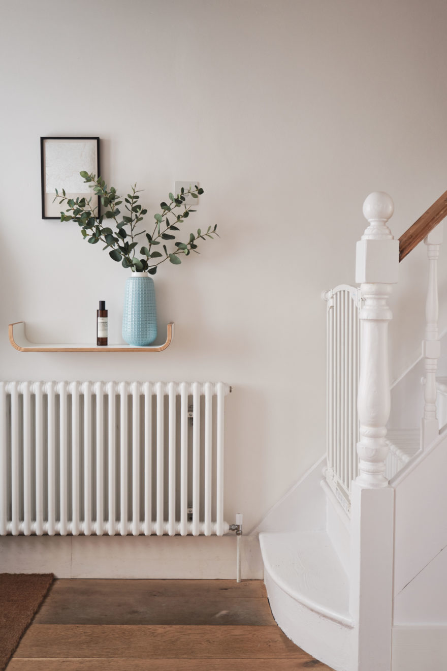
Warner homes are robust, well-built and many have managed to retain key original features. This was partially the case and where possible, we retained or sourced new elements to reinforce the traditional Warner aesthetic. For plaster cornices and skirtings, the client had managed to source historical photos of neighbouring houses which were used as a reference to find the best match. As previously mentioned, a new Warner door was made, templated from an original and made by a bespoke door fabricator.
Because of the flow of the space and how it opens to the garden, it’s ideal for a couple with (or thinking of) starting a family. Also anyone looking for a peaceful and more open space in which to live, with the added bonus of a garden that can be planted to visually make the most of the materials that now exist. The area really appeals to young families and creatives as there’s a great local park, plenty of independent shops and cafes and the William Morris Gallery for further home and garden inspiration.
For more information on DEDRAFT, visit their website.

